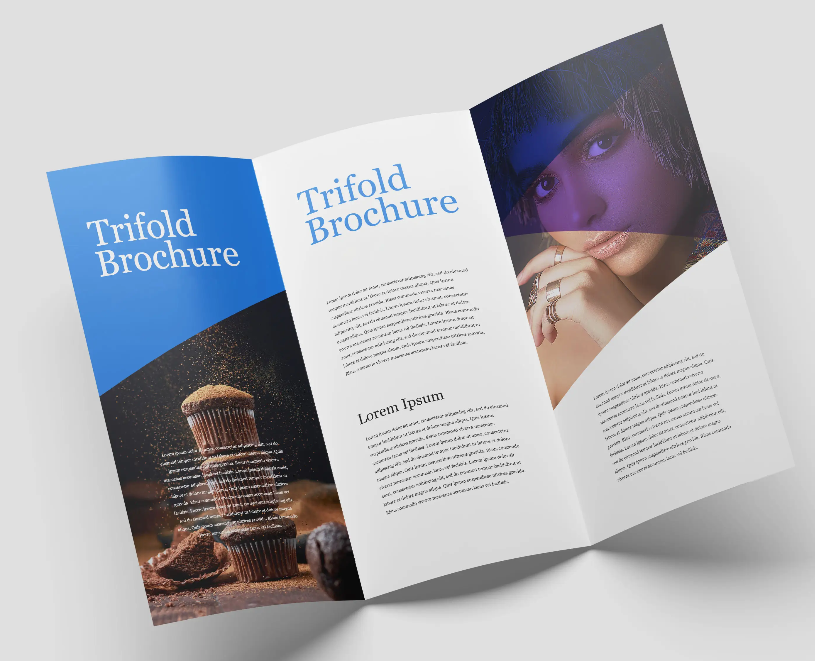
Creating eye-catching brochures is an essential aspect of marketing. A well-designed brochure can captivate your audience and convey your message effectively. However, brochure printing is not just about design; it also involves several technical and strategic considerations. This guide will provide you with valuable tips on how to create brochures that stand out.
Understanding Your Audience
Before you begin the design process, you must first define your target audience. Knowing who will get your brochure allows you to modify its content and design. Are they professionals, students, or regular customers? Understanding their tastes and wants ensures that your brochure printing appeals to them. This tailored strategy raises the possibility that your leaflet will be read and remembered.
Planning Your Content
When it comes to brochure printing, content is king. Prepare your content meticulously. Begin with a striking headline that draws attention. Follow up with short, informative prose that communicates your message. Use bullet points and brief paragraphs to make your information easier to read. Include critical information such as contact information, services, or product advantages. Remember that the purpose is to engage and inform your audience.
Choosing the Right Colors
Colors play an important part in brochure printing. They can elicit emotions and establish the tone for your message. Choose colors that are consistent with your brand and appealing to your target demographic. Use contrasting colors to make the words stand out. However, avoid using too many colors, as they might make your brochure appear cluttered. A consistent color scheme guarantees a professional and polished appearance.
Selecting the Perfect Fonts
Font selection is critical in brochure printing. Fonts should be easy to read and reflect your brand’s personality. Use bold fonts for headings and simple fonts for body writing. To keep your design clean and consistent, stick to two or three fonts. Additionally, make sure the text size is readable even from a distance. This makes your brochure more accessible to a wider audience.
High-Quality Images
Images are effective instruments in brochure printing. They are capable of capturing attention and conveying messages rapidly. Use high-resolution photos to maintain clarity and professionalism. Avoid utilizing stock photos that appear generic. Instead, choose unique graphics that reflect your brand’s identity. Additionally, ensure that the photos are relevant to your content and enhance the overall message.
Effective Use of Space
Effective use of space is critical in brochure printing. Avoid cluttering your brochure with content and photos. Use white space judiciously to allow your design to breathe. This improves your brochure’s visual appeal and readability. Well-placed content helps the reader’s eye move smoothly through the brochure.
Incorporating Graphics and Icons
Graphics and icons might help you improve your brochure printing. They break up the text and provide visual appeal. Use symbols to emphasize important points or steps. Graphics can represent complex thoughts or processes. Ensure that these elements are consistent with your overall design and color palette. This integration makes your brochure look more current and professional.
Crafting a Compelling Call to Action
Each brochure should have a call to action (CTA). This explains what the reader should do next. A clear call to action encourages people to visit your website, call for further information, or make a purchase. Use appealing words to make the CTA stand out. This can considerably improve the efficiency of your brochure printing.
Choosing the Right Paper
The type of paper you use for brochure printing has an impact on the finished result. High-quality paper provides an air of professionalism. The glossy paper makes colors and images more lively. Matte paper provides a more subdued, elegant appearance. When selecting a paper, think about your brand and the message you want to express. The appropriate decision might improve the overall appearance of your brochure.
Considering Folding Options
Folding options are an integral part of brochure printing. Different folds can make presentations more interesting. The most common folds are the tri-fold, bi-fold, and z-fold. Each provides unique features and is appropriate for a variety of content categories. When deciding on a fold, think about how your audience will engage with the brochure. This decision influences the flow and readability of your material.
Proofreading and Editing
Proofreading and editing are important tasks in brochure printing. Errors might damage your credibility. Review your brochure several times, and invite others to do the same. Check for spelling, grammatical, and punctuation mistakes. Ensure that the material flows logically and is easy to grasp. This extensive review procedure results in a polished and professional final product.
Printing Techniques
Different printing procedures might improve your brochure printing. Digital printing is inexpensive for small runs and has short turnaround times. Offset printing is great for big quantities and produces high-quality results. Consider adding a touch of luxury with specific finishes such as embossing, foil stamping, or spot UV. These tactics will help your brochure stand out and leave a lasting impact.
Sustainability in Printing
Sustainability is becoming more essential in brochure printing. Many customers prefer ecologically responsible brands. Choose recycled paper and environmentally friendly inks. Collaborate with printers who use sustainable practices. Highlight your dedication to sustainability in your brochure. This not only appeals to environmentally conscious customers, but it also reflects well on your brand.
Distribution Strategies
Distribution is a critical component of brochure production. Decide how and where your brochures will be delivered. Options include direct mail, in-store displays, trade shows, and events. Consider collaborating with businesses or groups to expand distribution. A well-planned distribution strategy guarantees that your brochure reaches the intended audience effectively.
Evaluating Brochure Performance
Evaluating the effectiveness of your brochures is critical. Measure indicators such as distribution volume, response rates, and sales conversions. Use unique codes or URLs to track engagement. Collect input from customers to determine what works and what does not. This evaluation helps to improve future brochure printing efforts for better results.
Creating eye-catching brochures involves meticulous preparation and attention to detail. Every step, from knowing your target audience to selecting the appropriate printing techniques, is critical. By following these guidelines, you can ensure that your brochure printing stands out and efficiently conveys your message. Invest in high-quality design and printing to leave a lasting impact on your target audience. Remember that a well-crafted brochure is a great marketing tool.


В этой статье представлен занимательный и актуальный контент, который заставит вас задуматься. Мы обсуждаем насущные вопросы и проблемы, а также освещаем истории, которые вдохновляют на действия и изменения. Узнайте, что стоит за событиями нашего времени!
Выяснить больше – https://vyvod-iz-zapoya-1.ru/